A photo of an accessibility button that would be used to open a door, however the button has fallen outside of the device and onto the floor, rendering it useless.

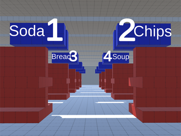
Part 1: Failed Standards

In this section, we look at why the small details of accessibility design matter so much, as well as how we might identify areas of importance to consider.
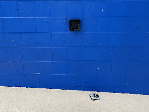
A 3D mockup of a grocery store. It's aisles are a bright red, the aisle end-signs are a bright blue, and the typography on the signage is big and rather ugly—but easily legible.

Part 2: Focusing In

In this section, we look at why even small details need to be part of the design process.

An illustration of a towering stack of papers. At top, we see the front cover for the 2010 ADA Standards for Accessible Design.

About This Website

Who made this website, and why did they make it like this?